
Custom Themes Compose
Today we are going to talk about themes and composition, as usual, design teams always have different themes and custom attributes than MaterialDesign theme so we can always use the material design as the default theme for the app, off course Android has created a custom solution for this problem so you do not have to depend on MaterialTheme,
Custom Themes Methods
The simplest approach is to add extension properties.
An example of this is to add an extension property to the Material Theme,
I do recommend this way if you do not have a lot of custom properties
private object CustomDesignSystemExtend {
    // [START android_compose_designsystems_custom_extend]
    // Use with MaterialTheme.colors.snackbarAction
    val Colors.snackbarAction: Color
        get() = if (isLight) Red300 else Red700

    // Use with MaterialTheme.typography.textFieldInput
    val Typography.textFieldInput: TextStyle
        get() = TextStyle(/* ... */)

    // Use with MaterialTheme.shapes.card
    val Shapes.card: Shape
        get() = RoundedCornerShape(size = 20.dp)
    // [END android_compose_designsystems_custom_extend]

    val Red300 = Color(0xFFE57373)
    val Red700 = Color(0xFFD32F2F)
}
this is an example of adding a custom extension property to MaterialTheme.
The best way to do it is to create your custom color, typo, shapes, dimensions, etc.. data immutable class, so even if you have multiple themes in the app you use the same object to fill the data with new values and use this theme in your app directly,
Start by creating your immutable data class that defines your app theme.
   @Immutable
    data class AmazingSpiderColors(
        val tertiary: Color,
        val onTertiary: Color,
        val secondary:Color,
        val onSecondary:Color,
        val primary:Color,
        val onPrimary:Color,
        val bottomActionBar:Color,
        val bottomActionBarText:Color
    )
Now create these colors by creating new objects, you can create multi-object for each theme
 val amazingSpiderColors = AmazingSpiderColors(
            tertiary = Color(0xFFA8EFF0),
            onTertiary = Color(0xFF002021,
            ...)
in this example we only create one color object for one theme you create one for Dark one for Light one for Men Dark, and also one for Women as an example,
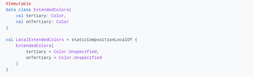
to access these colors through its compose theme you need to create its staticCompositionLocalOf,
 val LocalAmazingSpiderColors = staticCompositionLocalOf {
        AmazingSpiderColors(
            tertiary = Color.Unspecified,
            onTertiary = Color.Unspecified
        )
    }
What is staticCompositionLocalOf?
staticCompositionLocalOf provides static, implicitly passed data in Jetpack Compose. Value changes recompose the entire area where it's used, ideal for infrequent changes and performance optimization. (vs. compositionLocalOf for tracked reads and fine-grained updates.)
now you can define your theme and provide these colors to it
@Composable
    fun AmazingSpiderTheme(
        content: @Composable () -> Unit
    ) {
        val amazingSpiderColors = AmazingSpiderColors(
            tertiary = Color(0xFFA8EFF0),
            onTertiary = Color(0xFF002021)
        )
        CompositionLocalProvider(LocalAmazingSpiderColors provides amazingSpiderColors) {
            MaterialTheme(
                /* colors = ..., typography = ..., shapes = ... */
                content = content
            )
        }
    }
Let's have a full example of this customization with buttons typos and shapes
object FullyCustomDesignSystem {
    // [START android_compose_designsystems_fully_custom]
    @Immutable
    data class CustomColors(
        val content: Color,
        val component: Color,
        val background: List<Color>
    )

    @Immutable
    data class CustomTypography(
        val body: TextStyle,
        val title: TextStyle
    )

    @Immutable
    data class CustomElevation(
        val default: Dp,
        val pressed: Dp
    )

    val LocalCustomColors = staticCompositionLocalOf {
        CustomColors(
            content = Color.Unspecified,
            component = Color.Unspecified,
            background = emptyList()
        )
    }
    val LocalCustomTypography = staticCompositionLocalOf {
        CustomTypography(
            body = TextStyle.Default,
            title = TextStyle.Default
        )
    }
    val LocalCustomElevation = staticCompositionLocalOf {
        CustomElevation(
            default = Dp.Unspecified,
            pressed = Dp.Unspecified
        )
    }

    @Composable
    fun CustomTheme(
        /* ... */
        content: @Composable () -> Unit
    ) {
        val customColors = CustomColors(
            content = Color(0xFFDD0D3C),
            component = Color(0xFFC20029),
            background = listOf(Color.White, Color(0xFFF8BBD0))
        )
        val customTypography = CustomTypography(
            body = TextStyle(fontSize = 16.sp),
            title = TextStyle(fontSize = 32.sp)
        )
        val customElevation = CustomElevation(
            default = 4.dp,
            pressed = 8.dp
        )
        CompositionLocalProvider(
            LocalCustomColors provides customColors,
            LocalCustomTypography provides customTypography,
            LocalCustomElevation provides customElevation,
            content = content
        )
    }

    // Use with eg. CustomTheme.elevation.small
    object CustomTheme {
        val colors: CustomColors
            @Composable
            get() = LocalCustomColors.current
        val typography: CustomTypography
            @Composable
            get() = LocalCustomTypography.current
        val elevation: CustomElevation
            @Composable
            get() = LocalCustomElevation.current
    }
    // [END android_compose_designsystems_fully_custom]

    // [START android_compose_designsystems_fully_custom_usage]
    @Composable
    fun CustomButton(
        onClick: () -> Unit,
        modifier: Modifier = Modifier,
        content: @Composable RowScope.() -> Unit
    ) {
        Button(
            colors = ButtonDefaults.buttonColors(
                containerColor = CustomTheme.colors.component,
                contentColor = CustomTheme.colors.content,
                disabledContainerColor = CustomTheme.colors.content
                    .copy(alpha = 0.12f)
                    .compositeOver(CustomTheme.colors.component),
                disabledContentColor = CustomTheme.colors.content
                    .copy(alpha = ContentAlpha.disabled)
            ),
            shape = ButtonShape,
            elevation = ButtonDefaults.elevatedButtonElevation(
                defaultElevation = CustomTheme.elevation.default,
                pressedElevation = CustomTheme.elevation.pressed
                /* disabledElevation = 0.dp */
            ),
            onClick = onClick,
            modifier = modifier,
            content = {
                ProvideTextStyle(
                    value = CustomTheme.typography.body
                ) {
                    content()
                }
            }
        )
    }

    val ButtonShape = RoundedCornerShape(percent = 50)
    // [END android_compose_designsystems_fully_custom_usage]
}
Please Look at this Article by android


And Github
 android
Member discussion